Designing emails that look consistent across different campaigns and audience segments is key to building trust and reinforcing your brand identity. Whether you’re sending promotions, newsletters, or onboarding messages, here’s how to ensure every email reflects the same professional quality—no matter the purpose or audience.
Define Your Style Guide
A style guide acts as the foundation for visual consistency. It should clearly outline your brand’s colors, fonts, logo usage, image style, button design, layout structure, and tone of voice. Define how headings, body text, and calls to action should appear across desktop and mobile formats. Share this guide with every team member to ensure everyone works within the same visual framework.
Use Templates and Modules
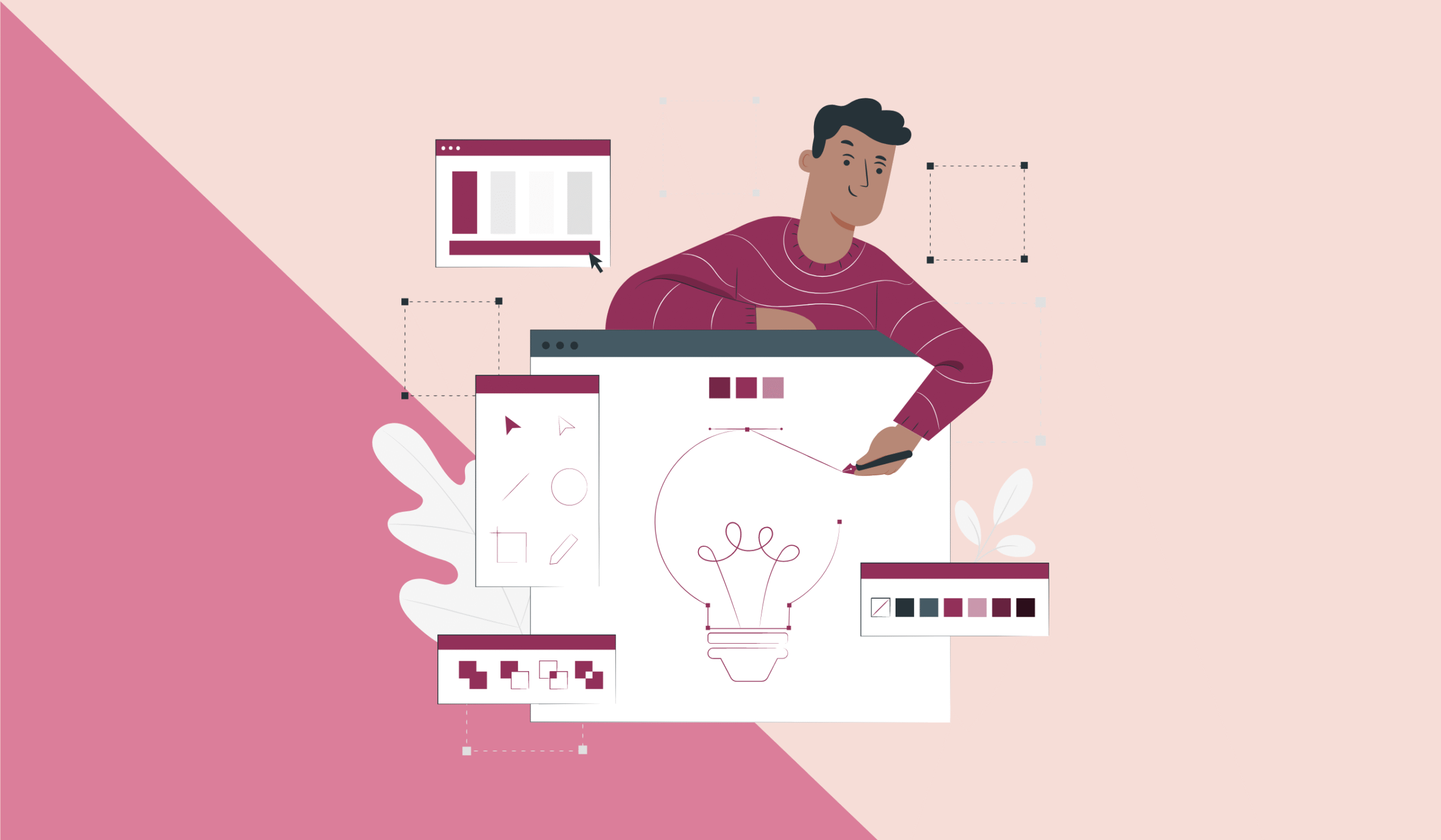
Templates and reusable modules save time and prevent visual drift across campaigns. Design a master template that reflects your brand guidelines and includes consistent header, footer, and layout elements. Modular design allows you to swap in new content while maintaining a uniform structure. Use tools like Figma, BEE Free, or your ESP’s native editor to manage these elements easily.
Test and Optimize Your Emails
Before sending, always test how your emails render across devices and clients. Tools like Litmus or Email on Acid can help preview your emails in various environments. Check for layout issues, broken links, and dark mode compatibility. Use A/B testing and performance data—such as open rates and CTR—to continuously refine subject lines, images, layout, and CTAs.
Follow Best Practices and Trends
Stick to email design fundamentals: use a single-column layout for mobile readability, place the CTA above the fold, and include ample white space for clarity. Contrast and visual hierarchy guide readers naturally. Personalize content where possible, segment based on behavior, and incorporate dynamic elements only when they add value. Keep your tone consistent and aligned with brand voice. Always include your sender name, footer, and unsubscribe option for credibility.
Here’s What Else to Consider
Consistency doesn’t mean you can’t experiment. Refresh your design gradually to keep things visually engaging without confusing loyal subscribers. Focus on accessibility—use alt text, good color contrast, and clear copy for all readers. Regularly audit your email assets to ensure alignment with your style guide. Above all, prioritize clarity, usability, and the user experience over flashy design trends.